Theming
Material Design theming adapts the components to a brand with colors, typefaces and shapes, while keeping their behavior.
Tokens
Link to “Tokens”Theming uses design tokens, named values such as colors and sizes that the components read.
Each component token maps to a system token, which has a concrete reference value.
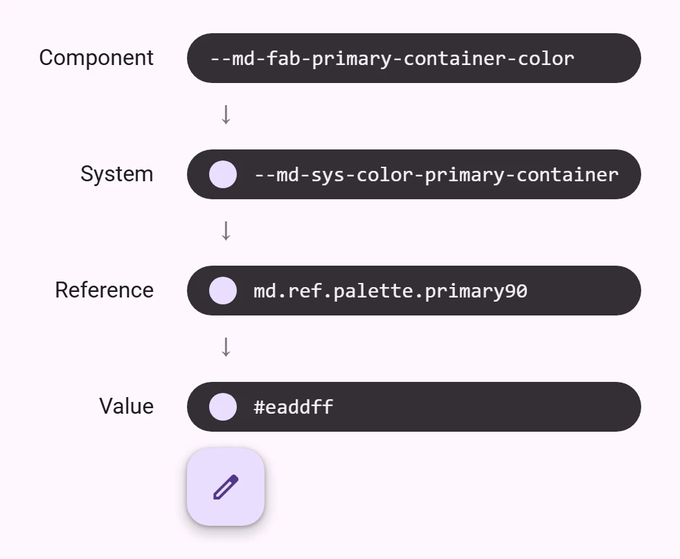
On the web, design tokens are CSS custom properties and can be scoped with CSS selectors.
.square-buttons {
  /* Changes all <petal-filled-button> instances matching the selector */
  --md-filled-button-container-shape: 0px;
}
Reference
Link to “Reference”Reference tokens hold concrete values, such as a hex color, pixel size, or font family name.
Typeface
Link to “Typeface”--md-ref-typeface tokens can be used to change font families and weights across all system and component tokens.
:root {
  --md-ref-typeface-brand: 'Open Sans';
  --md-ref-typeface-plain: 'Open Sans';
}
Palette
Link to “Palette”Palette tones (--md-ref-palette-*) are not custom properties. System colors fall back to the tone's value directly; set --md-sys-color-* tokens instead.
System
Link to “System”System tokens define decisions and roles that give the design system its character, from color and typography, to elevation and shape.
Color
Link to “Color”--md-sys-color tokens define dynamic color roles that map to components. See the color guide for more details.
:root {
  --md-sys-color-primary: red;
  --md-sys-color-secondary: blue;
}
Typography
Link to “Typography”--md-sys-typescale tokens define typescale roles that map to components. See the typography guide for more details.
:root {
  --md-sys-typescale-body-medium-size: 1rem;
  --md-sys-typescale-body-medium-line-height: 1.5rem;
}
Shape
Link to “Shape”--md-sys-shape tokens define corner shapes used in components. See the shape guide for more details.
:root {
  --md-sys-shape-corner-small: 4px;
  --md-sys-shape-corner-medium: 6px;
  --md-sys-shape-corner-large: 8px;
}
Motion
Link to “Motion”tokens/css/sys.css defines the motion tokens: durations, easings, and springs as --md-sys-motion-spring-<fast|default|slow>-<spatial|effects> (a CSS linear() easing) with a matching -duration. The Expressive features use the springs, for example for shape morphing.
:root {
  /* Slower, softer spatial spring for every component that uses it. */
  --md-sys-motion-spring-fast-spatial: var(--md-sys-motion-spring-default-spatial);
  --md-sys-motion-spring-fast-spatial-duration: var(--md-sys-motion-spring-default-spatial-duration);
}
Load tokens/css/motion-expressive.css to switch to the expressive motion scheme. See Material 3 Expressive features.
Component
Link to “Component”Component tokens are design attributes assigned to elements. They can be system tokens or concrete values.
:root {
  --md-filled-button-container-shape: 0px;
}

petal-filled-button.error {
  --md-filled-button-container-color: var(--md-sys-color-error);
  --md-filled-button-label-text-color: var(--md-sys-color-on-error);
}
Refer to each components' documentation for available tokens.
bookmark unlike --md-ref-* and --md-sys-* tokens, which are prefixed with ref and sys, component tokens are not prefixed with comp.