Button group
Button groups arrange related buttons in a row. A Material 3 Expressive component.
Usage
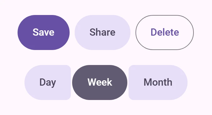
Link to “Usage”Put buttons in a <petal-button-group>. In a standard group the buttons are spaced apart; a pressed button widens by 15% of its width and its neighbors make room, while the group keeps its width.
<petal-button-group>
  <petal-filled-tonal-button>Day</petal-filled-tonal-button>
  <petal-filled-tonal-button>Week</petal-filled-tonal-button>
  <petal-filled-tonal-button>Month</petal-filled-tonal-button>
</petal-button-group>
Connected
Link to “Connected”connected places the buttons 2px apart with small inner corners. The inner corners get smaller while a button is pressed, and a selected toggle button is fully round. With single-select, selecting a toggle button deselects the others, and clicking the selected one keeps it selected.
<petal-button-group connected single-select>
  <petal-filled-tonal-button toggle>Day</petal-filled-tonal-button>
  <petal-filled-tonal-button toggle selected>Week</petal-filled-tonal-button>
  <petal-filled-tonal-button toggle>Month</petal-filled-tonal-button>
</petal-button-group>
Sizes
Link to “Sizes”size (xsmall to xlarge, default small) sets the spacing and corners of the group. Buttons without their own size get the group's size.
<div style="display: grid; gap: 16px; justify-items: center">
  <petal-button-group connected size="xsmall">
    <petal-outlined-button>One</petal-outlined-button>
    <petal-outlined-button>Two</petal-outlined-button>
    <petal-outlined-button>Three</petal-outlined-button>
  </petal-button-group>
  <petal-button-group connected size="small">
    <petal-outlined-button>One</petal-outlined-button>
    <petal-outlined-button>Two</petal-outlined-button>
    <petal-outlined-button>Three</petal-outlined-button>
  </petal-button-group>
  <petal-button-group connected size="medium">
    <petal-outlined-button>One</petal-outlined-button>
    <petal-outlined-button>Two</petal-outlined-button>
    <petal-outlined-button>Three</petal-outlined-button>
  </petal-button-group>
</div>
Accessibility
Link to “Accessibility”The group has role="group". Give it an accessible name with aria-label or aria-labelledby when the buttons' purpose is not clear on its own.
<petal-button-group aria-label="Calendar view" connected single-select>
  <petal-filled-tonal-button toggle selected>Day</petal-filled-tonal-button>
  <petal-filled-tonal-button toggle>Week</petal-filled-tonal-button>
</petal-button-group>
Toggle buttons set aria-pressed.
Theming
Link to “Theming”A button group has no tokens of its own; its spacing and corners come from md.comp.button-group.* in the Material Design tokens v34. Theme the buttons inside it as usual. See Material 3 Expressive features for the values.
PetalButtonGroup <petal-button-group>
Link to “PetalButtonGroup <petal-button-group>” Properties
Link to “Properties”| Property | Attribute | Type | Default | Description |
|---|---|---|---|---|
size | size | ButtonSize | 'small' | Size of the group and of buttons that have no size of their own. |
connected | connected | boolean | false | Connected layout: buttons 2px apart with small inner corners. |
singleSelect | single-select | boolean | false | Only one toggle button can be selected. Selecting one deselects the others; clicking the selected one keeps it selected. |