Chips
Chips are compact elements for entering information, choosing options, filtering content or starting actions.
While buttons are expected to appear consistently and with familiar calls to action, chips should appear dynamically as a group of multiple interactive elements.
Types
Link to “Types”Interactive Demo
Link to “Interactive Demo”View interactive demo inline.
Open interactive demo in new tab.
Usage
Link to “Usage”Choose the type of chip based on its purpose and author.
- Assist chips are common actions, such as adding an event to a calendar.
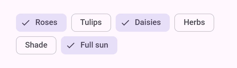
- Filter chips are tags used to filter content, such as shopping categories.
- Input chips are pieces of information entered by a user, such as event attendees.
- Suggestion chips represent dynamic suggestions for user input, such as text message replies.
<petal-chip-set>
  <petal-assist-chip label="Assist"></petal-assist-chip>
  <petal-filter-chip label="Filter"></petal-filter-chip>
  <petal-input-chip label="Input"></petal-input-chip>
  <petal-suggestion-chip label="Suggestion"></petal-suggestion-chip>
</petal-chip-set>
Chip sets
Link to “Chip sets”Chips should always appear in a set. Chip sets are toolbars that can display any type of chip or other toolbar items.
<h3>New event</h3>
<petal-chip-set>
  <petal-filter-chip label="All day"></petal-filter-chip>
  <petal-assist-chip label="Add to calendar"></petal-assist-chip>
  <petal-assist-chip label="Set a reminder"></petal-assist-chip>
</petal-chip-set>
Icons
Link to “Icons”All chips may display an optional icon. Input chips can specify if an avatar picture is displayed.
attribute to chip sets or reference a label with aria-labelledby. Add an aria-label to chips whose labels need to be more descriptive.
<h3 id="dates-label">Dates</h3>
<petal-chip-set aria-labelledby="dates-label">
  <petal-filter-chip label="Mon" aria-label="Monday"></petal-filter-chip>
  <petal-filter-chip label="Tue" aria-label="Tuesday"></petal-filter-chip>
  <petal-filter-chip label="Wed" aria-label="Wednesday"></petal-filter-chip>
</petal-chip-set>
Focusable and disabled
Link to “Focusable and disabled”By default, disabled chips are not focusable with the keyboard, while "soft-disabled" chips are. Some use cases encourage focusability of disabled toolbar items to increase their discoverability.
See the ARIA guidelines on focusability of disabled controls for guidance on when this is recommended.
<petal-chip-set aria-label="Actions">
  <!--
    Disabled until text is selected. Since both are disabled by default, keep
    them focusable so that screen readers can discover the actions available.
  -->
  <petal-assist-chip label="Copy" soft-disabled></petal-assist-chip>
  <petal-assist-chip label="Paste" soft-disabled></petal-assist-chip>
</petal-chip-set>
<petal-outlined-text-field type="textarea"></petal-outlined-text-field>
Assist chip
Link to “Assist chip”Assist chips offer a related action, such as adding an event to a calendar.
Assist chips function as though the user asked an assistant to complete the action. They should appear dynamically and contextually in a UI.
narrow down content with tags or keywords. They can replace a row of toggle buttons or checkboxes.
show pieces of information that the user entered, such as recipients or search terms.
Input chips whose icons are user images may add the avatar attribute to display the image in a larger circle.
offer generated suggestions, such as quick replies or search refinements.
Assist chip example
Link to “Assist chip example”<style>
:root {
--md-assist-chip-container-shape: 0px;
--md-assist-chip-label-text-font: system-ui;
--md-sys-color-outline: #6F7979;
--md-sys-color-on-surface: #191C1C;
}
</style>
<petal-assist-chip label="Assist"></petal-assist-chip>Filter chip tokens
Link to “Filter chip tokens”| Token | Default value |
|---|---|
--md-filter-chip-selected-container-color | --md-sys-color-secondary-container |
--md-filter-chip-outline-color | --md-sys-color-outline |
--md-filter-chip-container-shape | --md-sys-shape-corner-small |
--md-filter-chip-icon-size | 18px |
--md-filter-chip-label-text-color | --md-sys-color-on-surface |
--md-filter-chip-label-text-font | --md-sys-typescale-label-large-font |
Filter chip example
Link to “Filter chip example”<style>
:root {
--md-filter-chip-container-shape: 0px;
--md-filter-chip-label-text-font: system-ui;
--md-sys-color-outline: #6f7979;
--md-sys-color-on-surface: #191c1c;
--md-sys-color-secondary-container: #cce8e7;
}
</style>
<petal-filter-chip label="Filter"></petal-filter-chip>Input chip tokens
Link to “Input chip tokens”| Token | Default value |
|---|---|
--md-input-chip-outline-color | --md-sys-color-outline |
--md-input-chip-container-shape | --md-sys-shape-corner-small |
--md-input-chip-icon-size | 18px |
--md-input-chip-label-text-color | --md-sys-color-on-surface |
--md-input-chip-label-text-font | --md-sys-typescale-label-large-font |
Input chip example
Link to “Input chip example”<style>
:root {
--md-input-chip-container-shape: 0px;
--md-input-chip-label-text-font: system-ui;
--md-sys-color-outline: #6f7979;
--md-sys-color-on-surface: #191c1c;
}
</style>
<petal-input-chip label="Input"></petal-input-chip>Suggestion chip tokens
Link to “Suggestion chip tokens”| Token | Default value |
|---|---|
--md-suggestion-chip-outline-color | --md-sys-color-outline |
--md-suggestion-chip-container-shape | --md-sys-shape-corner-small |
--md-suggestion-chip-icon-size | 18px |
--md-suggestion-chip-label-text-color | --md-sys-color-on-surface |
--md-suggestion-chip-label-text-font | --md-sys-typescale-label-large-font |
Suggestion chip example
Link to “Suggestion chip example”<style>
:root {
--md-suggestion-chip-container-shape: 0px;
--md-suggestion-chip-label-text-font: system-ui;
--md-sys-color-outline: #6f7979;
--md-sys-color-on-surface: #191c1c;
}
</style>
<petal-suggestion-chip label="Suggestion"></petal-suggestion-chip>PetalChipSet <petal-chip-set>
Link to “PetalChipSet <petal-chip-set>” Properties
Link to “Properties”| Property | Attribute | Type | Default | Description |
|---|---|---|---|---|
chips | Chip[] | undefined |
PetalAssistChip <petal-assist-chip>
Link to “PetalAssistChip <petal-assist-chip>” Properties
Link to “Properties”| Property | Attribute | Type | Default | Description |
|---|---|---|---|---|
elevated | elevated | boolean | false | |
href | href | string | '' | |
download | download | string | '' | The filename to use when downloading the linked resource. If not specified, the browser will determine a filename. This is only applicable when the chip is used as a link (href is set). |
target | target | "" | "_blank" | "_parent" | "_self" | "_top" | '' | |
rel | rel | string | '' | Sets the underlying HTMLAnchorElement's rel attribute when href is set. |
referrerPolicy | referrerpolicy | string | '' | Sets the underlying HTMLAnchorElement's referrerpolicy attribute when href is set. |
disabled | disabled | boolean | false | Whether or not the chip is disabled. Disabled chips are not focusable, unless always-focusable is set. |
softDisabled | soft-disabled | boolean | false | Whether or not the chip is "soft-disabled" (disabled but still focusable). Use this when a chip needs increased visibility when disabled. See https://www.w3.org/WAI/ARIA/apg/practices/keyboard-interface/#kbd_disabled_controls for more guidance on when this is needed. |
alwaysFocusable | always-focusable | boolean | false | When true, allow disabled chips to be focused with arrow keys. Add this when a chip needs increased visibility when disabled. See https://www.w3.org/WAI/ARIA/apg/practices/keyboard-interface/#kbd_disabled_controls for more guidance on when this is needed. |
label | label | string | '' | The label of the chip. |
hasIcon | has-icon | boolean | false | Only needed for SSR. Add this attribute when a chip has a slot="icon" to avoid a Flash Of Unstyled Content. |
Events
Link to “Events”| Event | Type | Bubbles | Composed | Description |
|---|---|---|---|---|
update-focus | Event | Yes | No | Dispatched when disabled is toggled. |
PetalFilterChip <petal-filter-chip>
Link to “PetalFilterChip <petal-filter-chip>” Properties
Link to “Properties”| Property | Attribute | Type | Default | Description |
|---|---|---|---|---|
elevated | elevated | boolean | false | |
removable | removable | boolean | false | |
selected | selected | boolean | false | |
hasSelectedIcon | has-selected-icon | boolean | false | Only needed for SSR. Add this attribute when a filter chip has a slot="selected-icon" to avoid a Flash Of Unstyled Content. |
disabled | disabled | boolean | false | Whether or not the chip is disabled. Disabled chips are not focusable, unless always-focusable is set. |
softDisabled | soft-disabled | boolean | false | Whether or not the chip is "soft-disabled" (disabled but still focusable). Use this when a chip needs increased visibility when disabled. See https://www.w3.org/WAI/ARIA/apg/practices/keyboard-interface/#kbd_disabled_controls for more guidance on when this is needed. |
alwaysFocusable | always-focusable | boolean | false | When true, allow disabled chips to be focused with arrow keys. Add this when a chip needs increased visibility when disabled. See https://www.w3.org/WAI/ARIA/apg/practices/keyboard-interface/#kbd_disabled_controls for more guidance on when this is needed. |
label | label | string | '' | The label of the chip. |
hasIcon | has-icon | boolean | false | Only needed for SSR. Add this attribute when a chip has a slot="icon" to avoid a Flash Of Unstyled Content. |
handleTrailingActionFocus | () => void | undefined | ||
ariaLabelRemove | string | undefined |
Events
Link to “Events”| Event | Type | Bubbles | Composed | Description |
|---|---|---|---|---|
remove | Event | No | No | Dispatched when the remove button is clicked. |
update-focus | Event | Yes | No | Dispatched when disabled is toggled. |
PetalInputChip <petal-input-chip>
Link to “PetalInputChip <petal-input-chip>” Properties
Link to “Properties”| Property | Attribute | Type | Default | Description |
|---|---|---|---|---|
avatar | avatar | boolean | false | |
href | href | string | '' | |
target | target | "" | "_blank" | "_parent" | "_self" | "_top" | '' | |
rel | rel | string | '' | Sets the underlying HTMLAnchorElement's rel attribute when href is set. |
referrerPolicy | referrerpolicy | string | '' | Sets the underlying HTMLAnchorElement's referrerpolicy attribute when href is set. |
removeOnly | remove-only | boolean | false | |
selected | selected | boolean | false | |
disabled | disabled | boolean | false | Whether or not the chip is disabled. Disabled chips are not focusable, unless always-focusable is set. |
softDisabled | soft-disabled | boolean | false | Whether or not the chip is "soft-disabled" (disabled but still focusable). Use this when a chip needs increased visibility when disabled. See https://www.w3.org/WAI/ARIA/apg/practices/keyboard-interface/#kbd_disabled_controls for more guidance on when this is needed. |
alwaysFocusable | always-focusable | boolean | false | When true, allow disabled chips to be focused with arrow keys. Add this when a chip needs increased visibility when disabled. See https://www.w3.org/WAI/ARIA/apg/practices/keyboard-interface/#kbd_disabled_controls for more guidance on when this is needed. |
label | label | string | '' | The label of the chip. |
hasIcon | has-icon | boolean | false | Only needed for SSR. Add this attribute when a chip has a slot="icon" to avoid a Flash Of Unstyled Content. |
handleTrailingActionFocus | () => void | undefined | ||
ariaLabelRemove | string | undefined |
Events
Link to “Events”| Event | Type | Bubbles | Composed | Description |
|---|---|---|---|---|
remove | Event | No | No | Dispatched when the remove button is clicked. |
update-focus | Event | Yes | No | Dispatched when disabled is toggled. |
PetalSuggestionChip <petal-suggestion-chip>
Link to “PetalSuggestionChip <petal-suggestion-chip>” Properties
Link to “Properties”| Property | Attribute | Type | Default | Description |
|---|---|---|---|---|
elevated | elevated | boolean | false | |
href | href | string | '' | |
download | download | string | '' | The filename to use when downloading the linked resource. If not specified, the browser will determine a filename. This is only applicable when the chip is used as a link (href is set). |
target | target | "" | "_blank" | "_parent" | "_self" | "_top" | '' | |
rel | rel | string | '' | Sets the underlying HTMLAnchorElement's rel attribute when href is set. |
referrerPolicy | referrerpolicy | string | '' | Sets the underlying HTMLAnchorElement's referrerpolicy attribute when href is set. |
disabled | disabled | boolean | false | Whether or not the chip is disabled. Disabled chips are not focusable, unless always-focusable is set. |
softDisabled | soft-disabled | boolean | false | Whether or not the chip is "soft-disabled" (disabled but still focusable). Use this when a chip needs increased visibility when disabled. See https://www.w3.org/WAI/ARIA/apg/practices/keyboard-interface/#kbd_disabled_controls for more guidance on when this is needed. |
alwaysFocusable | always-focusable | boolean | false | When true, allow disabled chips to be focused with arrow keys. Add this when a chip needs increased visibility when disabled. See https://www.w3.org/WAI/ARIA/apg/practices/keyboard-interface/#kbd_disabled_controls for more guidance on when this is needed. |
label | label | string | '' | The label of the chip. |
hasIcon | has-icon | boolean | false | Only needed for SSR. Add this attribute when a chip has a slot="icon" to avoid a Flash Of Unstyled Content. |
Events
Link to “Events”| Event | Type | Bubbles | Composed | Description |
|---|---|---|---|---|
update-focus | Event | Yes | No | Dispatched when disabled is toggled. |