Icon Buttons
This documentation is fully rendered on the petal-elements catalog.
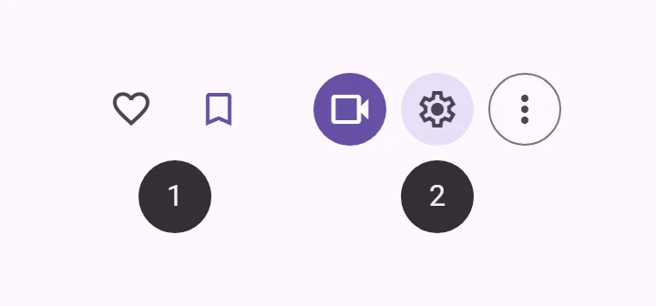
Icon buttons start secondary actions with a single icon.
Interactive Demo
Link to “Interactive Demo”View interactive demo inline.
Open interactive demo in new tab.
Types
Link to “Types”Usage
Link to “Usage”Use icon buttons to display actions in a compact layout. Icon buttons can represent opening actions such as opening an overflow menu or search, or represent binary actions that can be toggled on and off, such as favorite or bookmark.
Icon buttons can be grouped together or they can stand alone.
To use icons by name, see the Icon documentation for loading the icon font.
<petal-icon-button>
  <petal-icon>check</petal-icon>
</petal-icon-button>
<petal-filled-icon-button>
  <petal-icon>check</petal-icon>
</petal-filled-icon-button>
<petal-filled-tonal-icon-button>
  <petal-icon>check</petal-icon>
</petal-filled-tonal-icon-button>
<petal-outlined-icon-button>
  <petal-icon>check</petal-icon>
</petal-outlined-icon-button>
Links
Link to “Links”Add an href and optionally a target attribute to turn the icon button into a link.
<petal-icon-button href="https://google.com">
  <petal-icon>check</petal-icon>
</petal-icon-button>
Toggle
Link to “Toggle”Toggle icon buttons allow a single choice to be selected or deselected, such as adding or removing something from favorites.
Add a second icon in the slot="selected" slot to change the icon when selected. Toggle icon buttons can be pre-selected by adding the selected attribute.
<div>
  <petal-icon-button toggle>
    <petal-icon>close</petal-icon>
    <petal-icon slot="selected">check</petal-icon>
  </petal-icon-button>
  <petal-filled-icon-button toggle>
    <petal-icon>close</petal-icon>
    <petal-icon slot="selected">check</petal-icon>
  </petal-filled-icon-button>
  <petal-filled-tonal-icon-button toggle>
    <petal-icon>close</petal-icon>
    <petal-icon slot="selected">check</petal-icon>
  </petal-filled-tonal-icon-button>
  <petal-outlined-icon-button toggle>
    <petal-icon>close</petal-icon>
    <petal-icon slot="selected">check</petal-icon>
  </petal-outlined-icon-button>
</div>
<div>
  <petal-icon-button toggle selected>
    <petal-icon>close</petal-icon>
    <petal-icon slot="selected">check</petal-icon>
  </petal-icon-button>
  <petal-filled-icon-button toggle selected>
    <petal-icon>close</petal-icon>
    <petal-icon slot="selected">check</petal-icon>
  </petal-filled-icon-button>
  <petal-filled-tonal-icon-button toggle selected>
    <petal-icon>close</petal-icon>
    <petal-icon slot="selected">check</petal-icon>
  </petal-filled-tonal-icon-button>
  <petal-outlined-icon-button toggle selected>
    <petal-icon>close</petal-icon>
    <petal-icon slot="selected">check</petal-icon>
  </petal-outlined-icon-button>
</div>
Accessibility
Link to “Accessibility”Add an aria-label attribute to icon buttons whose labels need a more descriptive label.
<petal-icon-button aria-label="Search for Contact">
  <petal-icon>search</petal-icon>
</petal-icon-button>
Toggle
Link to “Toggle”Add an aria-label-selected attribute to toggle buttons whose labels need a more descriptive label when selected.
<petal-icon-button toggle
  aria-label="Unselected"
  aria-label-selected="Selected">
  <petal-icon>close</petal-icon>
  <petal-icon slot="selected">check</petal-icon>
</petal-icon-button>
Focusable and disabled
Link to “Focusable and disabled”By default, disabled icon buttons are not focusable with the keyboard, while "soft-disabled" icon buttons are. Some use cases encourage focusability of disabled toolbar items to increase their discoverability.
See the ARIA guidelines on focusability of disabled controls for guidance on when this is recommended.
<div role="toolbar">
  <petal-icon-button aria-label="Copy">
    <petal-icon>copy</petal-icon>
  </petal-icon-button>
  <petal-icon-button aria-label="Cut">
    <petal-icon>cut</petal-icon>
  </petal-icon-button>
  <!--
    This icon button is disabled but kept focusable to improve its
    discoverability in the toolbar.
  -->
  <petal-icon-button aria-label="Paste" soft-disabled>
    <petal-icon>paste</petal-icon>
  </petal-icon-button>
</div>
Icon Button
Link to “Icon Button”Standard icon buttons do not have a background or outline, and have the lowest emphasis of the icon buttons.
<petal-icon-button>
  <petal-icon>check</petal-icon>
</petal-icon-button>
Filled Icon Button
Link to “Filled Icon Button”Filled icon buttons have higher visual impact and are best for high emphasis actions.
<petal-filled-icon-button>
  <petal-icon>check</petal-icon>
</petal-filled-icon-button>
Filled Tonal Icon Button
Link to “Filled Tonal Icon Button”Filled tonal icon buttons are a middle ground between filled and outlined icon buttons. They're useful in contexts where the button requires slightly more emphasis than an outline would give, such as a secondary action paired with a high emphasis action.
<petal-filled-tonal-icon-button>
  <petal-icon>check</petal-icon>
</petal-filled-tonal-icon-button>
Outlined Icon Button
Link to “Outlined Icon Button”Outlined icon buttons are medium-emphasis buttons. They're useful when an icon button needs more emphasis than a standard icon button but less than a filled or filled tonal icon button.
<petal-outlined-icon-button>
  <petal-icon>check</petal-icon>
</petal-outlined-icon-button>
Theming
Link to “Theming”Icon Button supports Material theming and can be customized in terms of color, and shape.
Icon Button tokens
Link to “Icon Button tokens”| Token | Default value |
|---|---|
--md-icon-button-icon-color | --md-sys-color-on-surface-variant |
--md-icon-button-state-layer-shape | --md-sys-shape-corner-full |
--md-icon-button-icon-size | 24px |
Icon Button example
Link to “Icon Button example”<style>
:root {
--md-icon-button-icon-size: 32px;
--md-sys-color-on-surface-variant: #dc362e;
background-color: #fff8f6;
}
</style>
<petal-icon-button>
<petal-icon>check</petal-icon>
</petal-icon-button>Filled Icon Button tokens
Link to “Filled Icon Button tokens”| Token | Default value |
|---|---|
--md-filled-icon-button-selected-container-color | --md-sys-color-primary |
--md-filled-icon-button-container-shape | --md-sys-shape-corner-full |
--md-filled-icon-button-container-width | 40px |
--md-filled-icon-button-container-height | 40px |
--md-filled-icon-button-icon-size | 24px |
Filled Icon Button example
Link to “Filled Icon Button example”<style>
:root {
--md-filled-icon-button-container-width: 80px;
--md-filled-icon-button-container-height: 80px;
--md-filled-icon-button-icon-size: 40px;
--md-filled-icon-button-container-shape: 0px;
--md-sys-color-primary: #dc362e;
background-color: #fff8f6;
}
</style>
<petal-filled-icon-button>
<petal-icon>check</petal-icon>
</petal-filled-icon-button>Filled Tonal Icon Button tokens
Link to “Filled Tonal Icon Button tokens”| Token | Default value |
|---|---|
--md-filled-tonal-icon-button-selected-container-color | --md-sys-color-secondary-container |
--md-filled-tonal-icon-button-container-shape | --md-sys-shape-corner-full |
--md-filled-tonal-icon-button-container-width | 40px |
--md-filled-tonal-icon-button-container-height | 40px |
--md-filled-tonal-icon-button-icon-size | 24px |
Filled Tonal Icon Button example
Link to “Filled Tonal Icon Button example”<style>
:root {
--md-filled-tonal-icon-button-container-width: 80px;
--md-filled-tonal-icon-button-container-height: 80px;
--md-filled-tonal-icon-button-container-shape: 0px;
--md-filled-tonal-icon-button-icon-size: 40px;
--md-sys-color-secondary-container: #006A6A;
}
</style>
<petal-filled-tonal-icon-button>
<petal-icon>check</petal-icon>
</petal-filled-tonal-icon-button>Outlined Icon Button tokens
Link to “Outlined Icon Button tokens”| Token | Default value |
|---|---|
--md-outlined-icon-button-outline-color | --md-sys-color-outline |
--md-outlined-icon-button-outline-width | 1px |
--md-outlined-icon-button-container-shape | --md-sys-shape-corner-full |
--md-outlined-icon-button-container-width | 40px |
--md-outlined-icon-button-container-height | 40px |
--md-outlined-icon-button-icon-size | 24px |
Outlined Icon Button example
Link to “Outlined Icon Button example”<style>
:root {
--md-outlined-icon-button-container-width: 80px;
--md-outlined-icon-button-container-height: 80px;
--md-outlined-icon-button-container-shape: 0px;
--md-outlined-icon-button-icon-size: 40px;
--md-outlined-icon-button-outline-width: 4px;
--md-sys-color-outline: #006A6A;
}
</style>
<petal-outlined-icon-button>
<petal-icon>check</petal-icon>
</petal-outlined-icon-button>PetalIconButton <petal-icon-button>
Link to “PetalIconButton <petal-icon-button>” Properties
Link to “Properties”| Property | Attribute | Type | Default | Description |
|---|---|---|---|---|
softDisabled | soft-disabled | boolean | false | "Soft-disables" the icon button (disabled but still focusable). Use this when an icon button needs increased visibility when disabled. See https://www.w3.org/WAI/ARIA/apg/practices/keyboard-interface/#kbd_disabled_controls for more guidance on when this is needed. |
flipIconInRtl | flip-icon-in-rtl | boolean | false | Flips the icon if it is in an RTL context at startup. |
href | href | string | '' | Sets the underlying HTMLAnchorElement's href resource attribute. |
download | download | string | '' | The filename to use when downloading the linked resource. If not specified, the browser will determine a filename. This is only applicable when the icon button is used as a link (href is set). |
target | target | "" | LinkTarget | '' | Sets the underlying HTMLAnchorElement's target attribute. |
rel | rel | string | '' | Sets the underlying HTMLAnchorElement's rel attribute when href is set. |
referrerPolicy | referrerpolicy | string | '' | Sets the underlying HTMLAnchorElement's referrerpolicy attribute when href is set. |
ariaLabelSelected | aria-label-selected | string | '' | The aria-label of the button when the button is toggleable and selected. |
toggle | toggle | boolean | false | When true, the button will toggle between selected and unselected states |
selected | selected | boolean | false | Sets the selected state. When false, displays the default icon. When true, displays the selected icon, or the default icon If no slot="selected" icon is provided. |
name | name | string | undefined | The HTML name to use in form submission. |
disabled | disabled | boolean | undefined | Whether or not the element is disabled. |
type | type | string | 'submit' | A string indicating the form submission behavior of the element. - submit: The element submits the form. This is the default value if the attribute is not specified, or if it is dynamically changed to an empty or invalid value. - reset: The element resets the form. - button: The element does nothing. |
value | value | string | '' | The value of the button. When combined with a name, the submitting button's name/value will be added to the form. |
form | HTMLFormElement | undefined | The associated form element with which this element's value will submit. | |
labels | NodeList | undefined | The labels this element is associated with. |
Events
Link to “Events”| Event | Type | Bubbles | Composed | Description |
|---|---|---|---|---|
input | InputEvent | Yes | Yes | Dispatched when a toggle button toggles |
change | Event | Yes | No | Dispatched when a toggle button toggles |
PetalFilledIconButton <petal-filled-icon-button>
Link to “PetalFilledIconButton <petal-filled-icon-button>” Properties
Link to “Properties”| Property | Attribute | Type | Default | Description |
|---|---|---|---|---|
softDisabled | soft-disabled | boolean | false | "Soft-disables" the icon button (disabled but still focusable). Use this when an icon button needs increased visibility when disabled. See https://www.w3.org/WAI/ARIA/apg/practices/keyboard-interface/#kbd_disabled_controls for more guidance on when this is needed. |
flipIconInRtl | flip-icon-in-rtl | boolean | false | Flips the icon if it is in an RTL context at startup. |
href | href | string | '' | Sets the underlying HTMLAnchorElement's href resource attribute. |
download | download | string | '' | The filename to use when downloading the linked resource. If not specified, the browser will determine a filename. This is only applicable when the icon button is used as a link (href is set). |
target | target | "" | LinkTarget | '' | Sets the underlying HTMLAnchorElement's target attribute. |
rel | rel | string | '' | Sets the underlying HTMLAnchorElement's rel attribute when href is set. |
referrerPolicy | referrerpolicy | string | '' | Sets the underlying HTMLAnchorElement's referrerpolicy attribute when href is set. |
ariaLabelSelected | aria-label-selected | string | '' | The aria-label of the button when the button is toggleable and selected. |
toggle | toggle | boolean | false | When true, the button will toggle between selected and unselected states |
selected | selected | boolean | false | Sets the selected state. When false, displays the default icon. When true, displays the selected icon, or the default icon If no slot="selected" icon is provided. |
name | name | string | undefined | The HTML name to use in form submission. |
disabled | disabled | boolean | undefined | Whether or not the element is disabled. |
type | type | string | 'submit' | A string indicating the form submission behavior of the element. - submit: The element submits the form. This is the default value if the attribute is not specified, or if it is dynamically changed to an empty or invalid value. - reset: The element resets the form. - button: The element does nothing. |
value | value | string | '' | The value of the button. When combined with a name, the submitting button's name/value will be added to the form. |
form | HTMLFormElement | undefined | The associated form element with which this element's value will submit. | |
labels | NodeList | undefined | The labels this element is associated with. |
Events
Link to “Events”| Event | Type | Bubbles | Composed | Description |
|---|---|---|---|---|
input | InputEvent | Yes | Yes | Dispatched when a toggle button toggles |
change | Event | Yes | No | Dispatched when a toggle button toggles |
PetalFilledTonalIconButton <petal-filled-tonal-icon-button>
Link to “PetalFilledTonalIconButton <petal-filled-tonal-icon-button>” Properties
Link to “Properties”| Property | Attribute | Type | Default | Description |
|---|---|---|---|---|
softDisabled | soft-disabled | boolean | false | "Soft-disables" the icon button (disabled but still focusable). Use this when an icon button needs increased visibility when disabled. See https://www.w3.org/WAI/ARIA/apg/practices/keyboard-interface/#kbd_disabled_controls for more guidance on when this is needed. |
flipIconInRtl | flip-icon-in-rtl | boolean | false | Flips the icon if it is in an RTL context at startup. |
href | href | string | '' | Sets the underlying HTMLAnchorElement's href resource attribute. |
download | download | string | '' | The filename to use when downloading the linked resource. If not specified, the browser will determine a filename. This is only applicable when the icon button is used as a link (href is set). |
target | target | "" | LinkTarget | '' | Sets the underlying HTMLAnchorElement's target attribute. |
rel | rel | string | '' | Sets the underlying HTMLAnchorElement's rel attribute when href is set. |
referrerPolicy | referrerpolicy | string | '' | Sets the underlying HTMLAnchorElement's referrerpolicy attribute when href is set. |
ariaLabelSelected | aria-label-selected | string | '' | The aria-label of the button when the button is toggleable and selected. |
toggle | toggle | boolean | false | When true, the button will toggle between selected and unselected states |
selected | selected | boolean | false | Sets the selected state. When false, displays the default icon. When true, displays the selected icon, or the default icon If no slot="selected" icon is provided. |
name | name | string | undefined | The HTML name to use in form submission. |
disabled | disabled | boolean | undefined | Whether or not the element is disabled. |
type | type | string | 'submit' | A string indicating the form submission behavior of the element. - submit: The element submits the form. This is the default value if the attribute is not specified, or if it is dynamically changed to an empty or invalid value. - reset: The element resets the form. - button: The element does nothing. |
value | value | string | '' | The value of the button. When combined with a name, the submitting button's name/value will be added to the form. |
form | HTMLFormElement | undefined | The associated form element with which this element's value will submit. | |
labels | NodeList | undefined | The labels this element is associated with. |
Events
Link to “Events”| Event | Type | Bubbles | Composed | Description |
|---|---|---|---|---|
input | InputEvent | Yes | Yes | Dispatched when a toggle button toggles |
change | Event | Yes | No | Dispatched when a toggle button toggles |
PetalOutlinedIconButton <petal-outlined-icon-button>
Link to “PetalOutlinedIconButton <petal-outlined-icon-button>” Properties
Link to “Properties”| Property | Attribute | Type | Default | Description |
|---|---|---|---|---|
softDisabled | soft-disabled | boolean | false | "Soft-disables" the icon button (disabled but still focusable). Use this when an icon button needs increased visibility when disabled. See https://www.w3.org/WAI/ARIA/apg/practices/keyboard-interface/#kbd_disabled_controls for more guidance on when this is needed. |
flipIconInRtl | flip-icon-in-rtl | boolean | false | Flips the icon if it is in an RTL context at startup. |
href | href | string | '' | Sets the underlying HTMLAnchorElement's href resource attribute. |
download | download | string | '' | The filename to use when downloading the linked resource. If not specified, the browser will determine a filename. This is only applicable when the icon button is used as a link (href is set). |
target | target | "" | LinkTarget | '' | Sets the underlying HTMLAnchorElement's target attribute. |
rel | rel | string | '' | Sets the underlying HTMLAnchorElement's rel attribute when href is set. |
referrerPolicy | referrerpolicy | string | '' | Sets the underlying HTMLAnchorElement's referrerpolicy attribute when href is set. |
ariaLabelSelected | aria-label-selected | string | '' | The aria-label of the button when the button is toggleable and selected. |
toggle | toggle | boolean | false | When true, the button will toggle between selected and unselected states |
selected | selected | boolean | false | Sets the selected state. When false, displays the default icon. When true, displays the selected icon, or the default icon If no slot="selected" icon is provided. |
name | name | string | undefined | The HTML name to use in form submission. |
disabled | disabled | boolean | undefined | Whether or not the element is disabled. |
type | type | string | 'submit' | A string indicating the form submission behavior of the element. - submit: The element submits the form. This is the default value if the attribute is not specified, or if it is dynamically changed to an empty or invalid value. - reset: The element resets the form. - button: The element does nothing. |
value | value | string | '' | The value of the button. When combined with a name, the submitting button's name/value will be added to the form. |
form | HTMLFormElement | undefined | The associated form element with which this element's value will submit. | |
labels | NodeList | undefined | The labels this element is associated with. |
Events
Link to “Events”| Event | Type | Bubbles | Composed | Description |
|---|---|---|---|---|
input | InputEvent | Yes | Yes | Dispatched when a toggle button toggles |
change | Event | Yes | No | Dispatched when a toggle button toggles |