Floating action buttons (FAB)
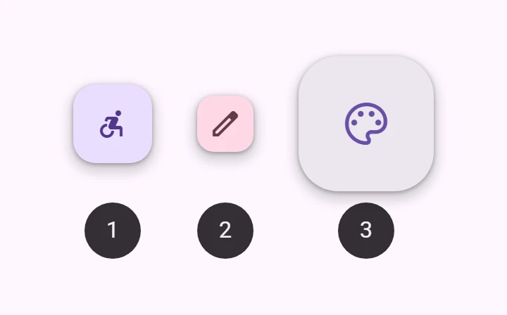
FAB is a button for the main action of a screen. It floats above the content so the action is always in reach.
Extended FABs add a text label to a FAB, which makes them wider and easier to hit.
- Design articles
- API Documentation (coming soon)
- Source code
Interactive Demo
Link to “Interactive Demo”View interactive demo inline.
Open interactive demo in new tab.
Types
Link to “Types”Extended FAB
Link to “Extended FAB”Usage
Link to “Usage”FABs should have an icon, such as a font petal-icon, an svg, or an img.
<petal-fab aria-label="Edit">
  <petal-icon slot="icon">edit</petal-icon>
</petal-fab>
Lowered
Link to “Lowered”FABs can be set to a lower elevation with the lowered attribute.
<petal-fab lowered aria-label="Edit">
  <petal-icon slot="icon">edit</petal-icon>
</petal-fab>
Accessibility
Link to “Accessibility”Icon-only FABs must include an aria-label that describes its action. Otherwise if aria-label is not provided, the FAB will default to announcing its visible contents.
<petal-fab aria-label="Edit">
  <petal-icon slot="icon">edit</petal-icon>
</petal-fab>
Extended FABs use their label for accessibility. Add an aria-label for additional context if needed. By supplying the label attribute, the extended FAB will make sure that the icon is not announced.
<petal-fab label="Edit" aria-label="Edit Comment">
  <petal-icon slot="icon">edit</petal-icon>
</petal-fab>FABs should display a clear and understandable icon.
<petal-fab aria-label="Edit">
  <petal-icon slot="icon">edit</petal-icon>
</petal-fab>
Extended
Link to “Extended”FABs may be extended with a label for additional emphasis. Extended FABs can omit their icon.
<petal-fab label="Edit">
  <petal-icon slot="icon">edit</petal-icon>
</petal-fab>
Without icon
Link to “Without icon”Extended FABs are the only FABs that can be used without an icon.
<petal-fab label="Reroute"></petal-fab>Colors
Link to “Colors”FAB colors may be changed with the variant attribute. It can be set to "surface" (default), "primary", "secondary", or "tertiary". These use the container colors (for example primary-container). For the solid colors, use "filled-primary", "filled-secondary", or "filled-tertiary" (see Material 3 Expressive features).
<petal-fab variant="primary" aria-label="Edit">
  <petal-icon slot="icon">edit</petal-icon>
</petal-fab>
<petal-fab variant="secondary" aria-label="Edit">
  <petal-icon slot="icon">edit</petal-icon>
</petal-fab>
<petal-fab variant="tertiary" aria-label="Edit">
  <petal-icon slot="icon">edit</petal-icon>
</petal-fab>
Sizes
Link to “Sizes”FABs may be small, medium (default), or large by setting the size attribute. Small FABs can optionally further reduce their touch target.
<petal-fab size="small" touch-target="none" aria-label="Edit">
  <petal-icon slot="icon">edit</petal-icon>
</petal-fab>
<petal-fab size="small" aria-label="Edit">
  <petal-icon slot="icon">edit</petal-icon>
</petal-fab>
<petal-fab aria-label="Edit">
  <petal-icon slot="icon">edit</petal-icon>
</petal-fab>
<petal-fab size="large" aria-label="Edit">
  <petal-icon slot="icon">edit</petal-icon>
</petal-fab>
Branded FAB
Link to “Branded FAB”Branded FABs use a brightly colored logo for their icon. Unlike FAB, branded FABs do not have color variants.
<petal-branded-fab size="small" aria-label="Add">
  <svg slot="icon" viewBox="0 0 36 36">
    <ellipse cx="18" cy="10" rx="5" ry="8" fill="#F48FB1"></ellipse>
    <ellipse cx="26" cy="18" rx="8" ry="5" fill="#EC407A"></ellipse>
    <ellipse cx="18" cy="26" rx="5" ry="8" fill="#F06292"></ellipse>
    <ellipse cx="10" cy="18" rx="8" ry="5" fill="#F8BBD0"></ellipse>
    <circle cx="18" cy="18" r="4" fill="#FFD54F"></circle>
  </svg>
</petal-branded-fab>
Extended
Link to “Extended”Branded FABs may be extended with a label for additional emphasis. Unlike FAB, branded FABs should always display their logo icon.
<petal-branded-fab label="Add">
  <svg slot="icon" viewBox="0 0 36 36">
    <ellipse cx="18" cy="10" rx="5" ry="8" fill="#F48FB1"></ellipse>
    <ellipse cx="26" cy="18" rx="8" ry="5" fill="#EC407A"></ellipse>
    <ellipse cx="18" cy="26" rx="5" ry="8" fill="#F06292"></ellipse>
    <ellipse cx="10" cy="18" rx="8" ry="5" fill="#F8BBD0"></ellipse>
    <circle cx="18" cy="18" r="4" fill="#FFD54F"></circle>
  </svg>
</petal-branded-fab>
Sizes
Link to “Sizes”Branded FABs may be medium (default) or large by setting the size attribute.
<petal-branded-fab aria-label="Add">
  <svg slot="icon" viewBox="0 0 36 36">
    <ellipse cx="18" cy="10" rx="5" ry="8" fill="#F48FB1"></ellipse>
    <ellipse cx="26" cy="18" rx="8" ry="5" fill="#EC407A"></ellipse>
    <ellipse cx="18" cy="26" rx="5" ry="8" fill="#F06292"></ellipse>
    <ellipse cx="10" cy="18" rx="8" ry="5" fill="#F8BBD0"></ellipse>
    <circle cx="18" cy="18" r="4" fill="#FFD54F"></circle>
  </svg>
</petal-branded-fab>
<petal-branded-fab size="large" aria-label="Add">
  <svg slot="icon" viewBox="0 0 36 36">
    <ellipse cx="18" cy="10" rx="5" ry="8" fill="#F48FB1"></ellipse>
    <ellipse cx="26" cy="18" rx="8" ry="5" fill="#EC407A"></ellipse>
    <ellipse cx="18" cy="26" rx="5" ry="8" fill="#F06292"></ellipse>
    <ellipse cx="10" cy="18" rx="8" ry="5" fill="#F8BBD0"></ellipse>
    <circle cx="18" cy="18" r="4" fill="#FFD54F"></circle>
  </svg>
</petal-branded-fab>
Theming
Link to “Theming”FAB supports Material theming and can be customized in terms of color, typography, and shape.
FAB tokens
Link to “FAB tokens”| Token | Default value |
|---|---|
--md-fab-container-color | --md-sys-color-surface-container-high |
--md-fab-lowered-container-color | --md-sys-color-surface-container-low |
--md-fab-container-shape | --md-sys-shape-corner-large |
--md-fab-icon-color | --md-sys-color-primary |
--md-fab-icon-size | 24px |
FAB example
Link to “FAB example”<style>
:root {
--md-sys-color-surface-container-high: #e3e9e9;
--md-sys-color-primary: #006a6a;
--md-fab-container-shape: 0px;
--md-fab-icon-size: 36px;
background-color: #f4fbfa;
}
</style>
<petal-fab aria-label="Edit">
<petal-icon slot="icon">edit</petal-icon>
</petal-fab>Sizes tokens
Link to “Sizes tokens”| Token | Default value |
|---|---|
--md-fab-small-container-shape | --md-sys-shape-corner-medium |
--md-fab-small-icon-size | 24px |
--md-fab-large-container-shape | --md-sys-shape-corner-extra-large |
--md-fab-large-icon-size | 36px |
Extended FAB tokens
Link to “Extended FAB tokens”| Token | Default value |
|---|---|
--md-fab-label-text-font | --md-sys-typescale-label-large-font |
Extended FAB example
Link to “Extended FAB example”<style>
:root {
--md-sys-color-surface-container-high: #e3e9e9;
--md-sys-color-on-surface: #161d1d;
--md-sys-color-primary: #006a6a;
--md-fab-container-shape: 0px;
--md-fab-icon-size: 36px;
background-color: #f4fbfa;
}
</style>
<petal-fab label="Edit">
<petal-icon slot="icon">edit</petal-icon>
</petal-fab>Branded FAB tokens
Link to “Branded FAB tokens”| Token | Default value |
|---|---|
--md-fab-branded-container-color | --md-sys-color-surface-container-high |
--md-fab-branded-container-shape | --md-sys-shape-corner-large |
--md-fab-branded-icon-size | 36px |
--md-fab-branded-label-text-font | --md-sys-typescale-label-large-font |
Branded FAB example
Link to “Branded FAB example”<style>
:root {
--md-sys-color-surface-container-high: #e3e9e9;
--md-sys-color-on-surface: #161d1d;
--md-fab-branded-icon-size: 48px;
--md-fab-branded-container-shape: 0px;
background-color: #f4fbfa;
}
</style>
<petal-branded-fab size="small" aria-label="Add">
<svg slot="icon" viewBox="0 0 36 36">
<ellipse cx="18" cy="10" rx="5" ry="8" fill="#F48FB1"></ellipse>
<ellipse cx="26" cy="18" rx="8" ry="5" fill="#EC407A"></ellipse>
<ellipse cx="18" cy="26" rx="5" ry="8" fill="#F06292"></ellipse>
<ellipse cx="10" cy="18" rx="8" ry="5" fill="#F8BBD0"></ellipse>
<circle cx="18" cy="18" r="4" fill="#FFD54F"></circle>
</svg>
</petal-branded-fab>
<petal-branded-fab size="small" label="Add">
<svg slot="icon" viewBox="0 0 36 36">
<ellipse cx="18" cy="10" rx="5" ry="8" fill="#F48FB1"></ellipse>
<ellipse cx="26" cy="18" rx="8" ry="5" fill="#EC407A"></ellipse>
<ellipse cx="18" cy="26" rx="5" ry="8" fill="#F06292"></ellipse>
<ellipse cx="10" cy="18" rx="8" ry="5" fill="#F8BBD0"></ellipse>
<circle cx="18" cy="18" r="4" fill="#FFD54F"></circle>
</svg>
</petal-branded-fab>PetalFab <petal-fab>
Link to “PetalFab <petal-fab>” Properties
Link to “Properties”| Property | Attribute | Type | Default | Description |
|---|---|---|---|---|
variant | variant | FabVariant | 'surface' | The FAB color variant to render. |
size | size | FabSize | 'medium' | The size of the FAB. NOTE: Branded FABs cannot be sized to small, and Extended FABs do not have different sizes. |
label | label | string | '' | The text to display on the FAB. |
lowered | lowered | boolean | false | Lowers the FAB's elevation. |
PetalBrandedFab <petal-branded-fab>
Link to “PetalBrandedFab <petal-branded-fab>” Properties
Link to “Properties”| Property | Attribute | Type | Default | Description |
|---|---|---|---|---|
variant | variant | FabVariant | 'surface' | The FAB color variant to render. |
size | size | FabSize | 'medium' | The size of the FAB. NOTE: Branded FABs cannot be sized to small, and Extended FABs do not have different sizes. |
label | label | string | '' | The text to display on the FAB. |
lowered | lowered | boolean | false | Lowers the FAB's elevation. |
Methods
Link to “Methods”| Method | Parameters | Returns | Description |
|---|---|---|---|
getRenderClasses | None | { primary: boolean; secondary: boolean; tertiary: boolean; small: boolean; 'filled-primary': boolean; 'filled-secondary': boolean; 'filled-tertiary': boolean; lowered: boolean; large: boolean; extended: boolean; } |