Buttons
Buttons start an action, such as sending a message or saving a form.
There are five types of common buttons: elevated, filled, filled tonal, outlined, and text.
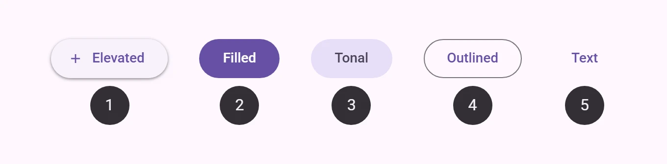
Interactive Demo
Link to “Interactive Demo”View interactive demo inline.
Open interactive demo in new tab.
Types
Link to “Types”Usage
Link to “Usage”Buttons have label text that describes the action that will occur if a user taps a button.
<petal-outlined-button>Back</petal-outlined-button>
<petal-filled-button>Complete</petal-filled-button>
Icon
Link to “Icon”An icon may optionally be added to a button to help communicate the button's action and help draw attention.
<petal-filled-tonal-button>
  Send
  <svg slot="icon" viewBox="0 0 48 48"><path d="M6 40V8l38 16Zm3-4.65L36.2 24 9 12.5v8.4L21.1 24 9 27Zm0 0V12.5 27Z"/></svg>
</petal-filled-tonal-button>

<petal-text-button trailing-icon>
  Open
  <svg slot="icon" viewBox="0 0 48 48"><path d="M9 42q-1.2 0-2.1-.9Q6 40.2 6 39V9q0-1.2.9-2.1Q7.8 6 9 6h13.95v3H9v30h30V25.05h3V39q0 1.2-.9 2.1-.9.9-2.1.9Zm10.1-10.95L17 28.9 36.9 9H25.95V6H42v16.05h-3v-10.9Z"/></svg>
</petal-text-button>
Sizes
Link to “Sizes”Buttons come in five sizes from the Material 3 Expressive button tokens: xsmall (32px), small (40px), medium (56px), large (96px) and xlarge (136px). Set the size attribute; without it, a button keeps the original 40px look.
<petal-filled-button size="xsmall">Extra small</petal-filled-button>
<petal-filled-button size="small">Small</petal-filled-button>
<petal-filled-button size="medium">Medium</petal-filled-button>
<petal-filled-button size="large">Large</petal-filled-button>
<petal-filled-button size="xlarge">XL</petal-filled-button>
Shapes
Link to “Shapes”Sized buttons are round by default. Set shape="square" for rounded square corners. While pressed, the corners morph to a smaller radius with a spring animation.
<petal-filled-tonal-button size="medium">Round</petal-filled-tonal-button>
<petal-filled-tonal-button size="medium" shape="square">Square</petal-filled-tonal-button>
Toggle buttons
Link to “Toggle buttons”Add toggle to make a button switch between unselected and selected on click, like Compose's ToggleButton. selected holds the state; the button fires input and change events when the user toggles it and sets aria-pressed. A selected round button becomes square and the other way round. Text buttons cannot be toggle buttons.
<div style="display: grid; grid-template-columns: repeat(4, auto); gap: 8px">
  <petal-filled-button size="small" toggle>Filled</petal-filled-button>
  <petal-filled-tonal-button size="small" toggle>Tonal</petal-filled-tonal-button>
  <petal-outlined-button size="small" toggle>Outlined</petal-outlined-button>
  <petal-elevated-button size="small" toggle>Elevated</petal-elevated-button>
  <petal-filled-button size="small" toggle selected>Filled</petal-filled-button>
  <petal-filled-tonal-button size="small" toggle selected>Tonal</petal-filled-tonal-button>
  <petal-outlined-button size="small" toggle selected>Outlined</petal-outlined-button>
  <petal-elevated-button size="small" toggle selected>Elevated</petal-elevated-button>
</div>
See Material 3 Expressive features for the values, the motion and where they follow Compose rather than the tokens. Several buttons can be put in a button group.
Accessibility
Link to “Accessibility”Add an aria-label attribute to buttons whose labels need a more descriptive label.
<petal-elevated-button aria-label="Add a new contact">Add</petal-elevated-button>Focusable and disabled
Link to “Focusable and disabled”By default, disabled buttons are not focusable with the keyboard, while "soft-disabled" buttons are. Some use cases encourage focusability of disabled toolbar items to increase their discoverability.
See the ARIA guidelines on focusability of disabled controls for guidance on when this is recommended.
<div role="toolbar">
  <petal-text-button>Copy</petal-text-button>
  <petal-text-button>Cut</petal-text-button>
  <!--
    This button is disabled but kept focusable to improve its discoverability
    in the toolbar.
  -->
  <petal-text-button soft-disabled>Paste</petal-text-button>
</div>
Elevated button
Link to “Elevated button”Elevated buttons are tonal buttons with a shadow. Use them sparingly, for example when a button sits on a busy background and needs to stand out.
<petal-elevated-button>Elevated</petal-elevated-button>Filled button
Link to “Filled button”Filled buttons have the strongest emphasis of the common buttons. Use them for the main action of a screen or flow, such as Save or Confirm.
<petal-filled-button>Filled</petal-filled-button>Filled tonal button
Link to “Filled tonal button”A filled tonal button sits between filled and outlined buttons: more emphasis than an outline, less than a solid fill. "Next" in a multi-step form is a typical use.
<petal-filled-tonal-button>Tonal</petal-filled-tonal-button>Outlined button
Link to “Outlined button”Outlined buttons have medium emphasis, for actions that matter but are not the main one on the screen.
<petal-outlined-button>Outlined</petal-outlined-button>Text button
Link to “Text button”Text buttons have the least emphasis. They suit secondary actions, especially when several options are shown together.
<petal-text-button>Text</petal-text-button>Theming
Link to “Theming”Button supports Material theming and can be customized in terms of color, typography, and shape.
Elevated button tokens
Link to “Elevated button tokens”| Token | Default value |
|---|---|
--md-elevated-button-container-color | --md-sys-color-surface |
--md-elevated-button-container-shape | --md-sys-shape-corner-full |
--md-elevated-button-label-text-color | --md-sys-color-on-surface |
--md-elevated-button-label-text-font | --md-sys-typescale-label-large-font |
Elevated button example
Link to “Elevated button example”<style>
:root {
--md-elevated-button-container-shape: 0px;
--md-elevated-button-label-text-font: system-ui;
--md-sys-color-surface-container-low: #FAFDFC;
--md-sys-color-primary: #191C1C;
}
</style>
<petal-elevated-button>Elevated</petal-elevated-button>Filled button tokens
Link to “Filled button tokens”| Token | Default value |
|---|---|
--md-filled-button-container-color | --md-sys-color-primary |
--md-filled-button-container-shape | --md-sys-shape-corner-full |
--md-filled-button-label-text-color | --md-sys-color-on-primary |
--md-filled-button-label-text-font | --md-sys-typescale-label-large-font |
Filled button example
Link to “Filled button example”<style>
:root {
--md-filled-button-container-shape: 0px;
--md-filled-button-label-text-font: system-ui;
--md-sys-color-primary: #006A6A;
--md-sys-color-on-primary: #FFFFFF;
}
</style>
<petal-filled-button>Filled</petal-filled-button>Filled tonal button tokens
Link to “Filled tonal button tokens”| Token | Default value |
|---|---|
--md-filled-tonal-button-container-color | --md-sys-color-secondary-container |
--md-filled-tonal-button-container-shape | --md-sys-shape-corner-full |
--md-filled-tonal-button-label-text-color | --md-sys-color-on-secondary-container |
--md-filled-tonal-button-label-text-font | --md-sys-typescale-label-large-font |
Filled tonal button example
Link to “Filled tonal button example”<style>
:root {
--md-filled-tonal-button-container-shape: 0px;
--md-filled-tonal-button-label-text-font: system-ui;
--md-sys-color-secondary-container: #CCE8E7;
--md-sys-color-on-secondary-container: #051F1F;
}
</style>
<petal-filled-tonal-button>Tonal</petal-filled-tonal-button>Outlined button tokens
Link to “Outlined button tokens”| Token | Default value |
|---|---|
--md-outlined-button-outline-color | --md-sys-color-outline |
--md-outlined-button-container-shape | --md-sys-shape-corner-full |
--md-outlined-button-label-text-color | --md-sys-color-primary |
--md-outlined-button-label-text-font | --md-sys-typescale-label-large-font |
Outlined button example
Link to “Outlined button example”<style>
:root {
--md-outlined-button-container-shape: 0px;
--md-outlined-button-label-text-font: system-ui;
--md-sys-color-primary: #006A6A;
--md-sys-color-outline: #6F7979;
}
</style>
<petal-outlined-button>Outlined</petal-outlined-button>Text button tokens
Link to “Text button tokens”| Token | Default value |
|---|---|
--md-text-button-label-text-color | --md-sys-color-primary |
--md-text-button-label-text-font | --md-sys-typescale-label-large-font |
Text button example
Link to “Text button example”<style>
:root {
--md-text-button-label-text-font: system-ui;
--md-sys-color-primary: #006A6A;
}
</style>
<petal-text-button>Text</petal-text-button>PetalElevatedButton <petal-elevated-button>
Link to “PetalElevatedButton <petal-elevated-button>” Properties
Link to “Properties”| Property | Attribute | Type | Default | Description |
|---|---|---|---|---|
softDisabled | soft-disabled | boolean | false | Whether or not the button is "soft-disabled" (disabled but still focusable). Use this when a button needs increased visibility when disabled. See https://www.w3.org/WAI/ARIA/apg/practices/keyboard-interface/#kbd_disabled_controls for more guidance on when this is needed. |
href | href | string | '' | The URL that the link button points to. |
download | download | string | '' | The filename to use when downloading the linked resource. If not specified, the browser will determine a filename. This is only applicable when the button is used as a link (href is set). |
target | target | "" | "_blank" | "_parent" | "_self" | "_top" | '' | Where to display the linked href URL for a link button. Common options include _blank to open in a new tab. |
rel | rel | string | '' | Sets the underlying HTMLAnchorElement's rel attribute when href is set. |
referrerPolicy | referrerpolicy | string | '' | Sets the underlying HTMLAnchorElement's referrerpolicy attribute when href is set. |
trailingIcon | trailing-icon | boolean | false | Whether to render the icon at the inline end of the label rather than the inline start. Note: Link buttons cannot have trailing icons. |
hasIcon | has-icon | boolean | false | Whether to display the icon or not. |
size | size | ButtonSize | undefined | Material 3 Expressive size. Sets the height, padding, icon size, label typescale and shapes, and makes the shape morph while pressed. Without a size, the button keeps its original metrics. |
shape | shape | ButtonShape | undefined | Container shape of a sized button: round (default) or square. |
toggle | toggle | boolean | false | When true, the button toggles between selected and unselected on click and exposes aria-pressed. Not available for text buttons or links. |
selected | selected | boolean | false | Whether a toggle button is selected. |
name | name | string | undefined | The HTML name to use in form submission. |
disabled | disabled | boolean | undefined | Whether or not the element is disabled. |
type | type | string | 'submit' | A string indicating the form submission behavior of the element. - submit: The element submits the form. This is the default value if the attribute is not specified, or if it is dynamically changed to an empty or invalid value. - reset: The element resets the form. - button: The element does nothing. |
value | value | string | '' | The value of the button. When combined with a name, the submitting button's name/value will be added to the form. |
form | HTMLFormElement | undefined | The associated form element with which this element's value will submit. | |
labels | NodeList | undefined | The labels this element is associated with. |
Events
Link to “Events”| Event | Type | Bubbles | Composed | Description |
|---|---|---|---|---|
input | InputEvent | Yes | Yes | Dispatched when a toggle button toggles |
change | Event | Yes | No | Dispatched when a toggle button toggles |
PetalFilledButton <petal-filled-button>
Link to “PetalFilledButton <petal-filled-button>” Properties
Link to “Properties”| Property | Attribute | Type | Default | Description |
|---|---|---|---|---|
softDisabled | soft-disabled | boolean | false | Whether or not the button is "soft-disabled" (disabled but still focusable). Use this when a button needs increased visibility when disabled. See https://www.w3.org/WAI/ARIA/apg/practices/keyboard-interface/#kbd_disabled_controls for more guidance on when this is needed. |
href | href | string | '' | The URL that the link button points to. |
download | download | string | '' | The filename to use when downloading the linked resource. If not specified, the browser will determine a filename. This is only applicable when the button is used as a link (href is set). |
target | target | "" | "_blank" | "_parent" | "_self" | "_top" | '' | Where to display the linked href URL for a link button. Common options include _blank to open in a new tab. |
rel | rel | string | '' | Sets the underlying HTMLAnchorElement's rel attribute when href is set. |
referrerPolicy | referrerpolicy | string | '' | Sets the underlying HTMLAnchorElement's referrerpolicy attribute when href is set. |
trailingIcon | trailing-icon | boolean | false | Whether to render the icon at the inline end of the label rather than the inline start. Note: Link buttons cannot have trailing icons. |
hasIcon | has-icon | boolean | false | Whether to display the icon or not. |
size | size | ButtonSize | undefined | Material 3 Expressive size. Sets the height, padding, icon size, label typescale and shapes, and makes the shape morph while pressed. Without a size, the button keeps its original metrics. |
shape | shape | ButtonShape | undefined | Container shape of a sized button: round (default) or square. |
toggle | toggle | boolean | false | When true, the button toggles between selected and unselected on click and exposes aria-pressed. Not available for text buttons or links. |
selected | selected | boolean | false | Whether a toggle button is selected. |
name | name | string | undefined | The HTML name to use in form submission. |
disabled | disabled | boolean | undefined | Whether or not the element is disabled. |
type | type | string | 'submit' | A string indicating the form submission behavior of the element. - submit: The element submits the form. This is the default value if the attribute is not specified, or if it is dynamically changed to an empty or invalid value. - reset: The element resets the form. - button: The element does nothing. |
value | value | string | '' | The value of the button. When combined with a name, the submitting button's name/value will be added to the form. |
form | HTMLFormElement | undefined | The associated form element with which this element's value will submit. | |
labels | NodeList | undefined | The labels this element is associated with. |
Events
Link to “Events”| Event | Type | Bubbles | Composed | Description |
|---|---|---|---|---|
input | InputEvent | Yes | Yes | Dispatched when a toggle button toggles |
change | Event | Yes | No | Dispatched when a toggle button toggles |
PetalFilledTonalButton <petal-filled-tonal-button>
Link to “PetalFilledTonalButton <petal-filled-tonal-button>” Properties
Link to “Properties”| Property | Attribute | Type | Default | Description |
|---|---|---|---|---|
softDisabled | soft-disabled | boolean | false | Whether or not the button is "soft-disabled" (disabled but still focusable). Use this when a button needs increased visibility when disabled. See https://www.w3.org/WAI/ARIA/apg/practices/keyboard-interface/#kbd_disabled_controls for more guidance on when this is needed. |
href | href | string | '' | The URL that the link button points to. |
download | download | string | '' | The filename to use when downloading the linked resource. If not specified, the browser will determine a filename. This is only applicable when the button is used as a link (href is set). |
target | target | "" | "_blank" | "_parent" | "_self" | "_top" | '' | Where to display the linked href URL for a link button. Common options include _blank to open in a new tab. |
rel | rel | string | '' | Sets the underlying HTMLAnchorElement's rel attribute when href is set. |
referrerPolicy | referrerpolicy | string | '' | Sets the underlying HTMLAnchorElement's referrerpolicy attribute when href is set. |
trailingIcon | trailing-icon | boolean | false | Whether to render the icon at the inline end of the label rather than the inline start. Note: Link buttons cannot have trailing icons. |
hasIcon | has-icon | boolean | false | Whether to display the icon or not. |
size | size | ButtonSize | undefined | Material 3 Expressive size. Sets the height, padding, icon size, label typescale and shapes, and makes the shape morph while pressed. Without a size, the button keeps its original metrics. |
shape | shape | ButtonShape | undefined | Container shape of a sized button: round (default) or square. |
toggle | toggle | boolean | false | When true, the button toggles between selected and unselected on click and exposes aria-pressed. Not available for text buttons or links. |
selected | selected | boolean | false | Whether a toggle button is selected. |
name | name | string | undefined | The HTML name to use in form submission. |
disabled | disabled | boolean | undefined | Whether or not the element is disabled. |
type | type | string | 'submit' | A string indicating the form submission behavior of the element. - submit: The element submits the form. This is the default value if the attribute is not specified, or if it is dynamically changed to an empty or invalid value. - reset: The element resets the form. - button: The element does nothing. |
value | value | string | '' | The value of the button. When combined with a name, the submitting button's name/value will be added to the form. |
form | HTMLFormElement | undefined | The associated form element with which this element's value will submit. | |
labels | NodeList | undefined | The labels this element is associated with. |
Events
Link to “Events”| Event | Type | Bubbles | Composed | Description |
|---|---|---|---|---|
input | InputEvent | Yes | Yes | Dispatched when a toggle button toggles |
change | Event | Yes | No | Dispatched when a toggle button toggles |
PetalOutlinedButton <petal-outlined-button>
Link to “PetalOutlinedButton <petal-outlined-button>” Properties
Link to “Properties”| Property | Attribute | Type | Default | Description |
|---|---|---|---|---|
softDisabled | soft-disabled | boolean | false | Whether or not the button is "soft-disabled" (disabled but still focusable). Use this when a button needs increased visibility when disabled. See https://www.w3.org/WAI/ARIA/apg/practices/keyboard-interface/#kbd_disabled_controls for more guidance on when this is needed. |
href | href | string | '' | The URL that the link button points to. |
download | download | string | '' | The filename to use when downloading the linked resource. If not specified, the browser will determine a filename. This is only applicable when the button is used as a link (href is set). |
target | target | "" | "_blank" | "_parent" | "_self" | "_top" | '' | Where to display the linked href URL for a link button. Common options include _blank to open in a new tab. |
rel | rel | string | '' | Sets the underlying HTMLAnchorElement's rel attribute when href is set. |
referrerPolicy | referrerpolicy | string | '' | Sets the underlying HTMLAnchorElement's referrerpolicy attribute when href is set. |
trailingIcon | trailing-icon | boolean | false | Whether to render the icon at the inline end of the label rather than the inline start. Note: Link buttons cannot have trailing icons. |
hasIcon | has-icon | boolean | false | Whether to display the icon or not. |
size | size | ButtonSize | undefined | Material 3 Expressive size. Sets the height, padding, icon size, label typescale and shapes, and makes the shape morph while pressed. Without a size, the button keeps its original metrics. |
shape | shape | ButtonShape | undefined | Container shape of a sized button: round (default) or square. |
toggle | toggle | boolean | false | When true, the button toggles between selected and unselected on click and exposes aria-pressed. Not available for text buttons or links. |
selected | selected | boolean | false | Whether a toggle button is selected. |
name | name | string | undefined | The HTML name to use in form submission. |
disabled | disabled | boolean | undefined | Whether or not the element is disabled. |
type | type | string | 'submit' | A string indicating the form submission behavior of the element. - submit: The element submits the form. This is the default value if the attribute is not specified, or if it is dynamically changed to an empty or invalid value. - reset: The element resets the form. - button: The element does nothing. |
value | value | string | '' | The value of the button. When combined with a name, the submitting button's name/value will be added to the form. |
form | HTMLFormElement | undefined | The associated form element with which this element's value will submit. | |
labels | NodeList | undefined | The labels this element is associated with. |
Events
Link to “Events”| Event | Type | Bubbles | Composed | Description |
|---|---|---|---|---|
input | InputEvent | Yes | Yes | Dispatched when a toggle button toggles |
change | Event | Yes | No | Dispatched when a toggle button toggles |
PetalTextButton <petal-text-button>
Link to “PetalTextButton <petal-text-button>” Properties
Link to “Properties”| Property | Attribute | Type | Default | Description |
|---|---|---|---|---|
softDisabled | soft-disabled | boolean | false | Whether or not the button is "soft-disabled" (disabled but still focusable). Use this when a button needs increased visibility when disabled. See https://www.w3.org/WAI/ARIA/apg/practices/keyboard-interface/#kbd_disabled_controls for more guidance on when this is needed. |
href | href | string | '' | The URL that the link button points to. |
download | download | string | '' | The filename to use when downloading the linked resource. If not specified, the browser will determine a filename. This is only applicable when the button is used as a link (href is set). |
target | target | "" | "_blank" | "_parent" | "_self" | "_top" | '' | Where to display the linked href URL for a link button. Common options include _blank to open in a new tab. |
rel | rel | string | '' | Sets the underlying HTMLAnchorElement's rel attribute when href is set. |
referrerPolicy | referrerpolicy | string | '' | Sets the underlying HTMLAnchorElement's referrerpolicy attribute when href is set. |
trailingIcon | trailing-icon | boolean | false | Whether to render the icon at the inline end of the label rather than the inline start. Note: Link buttons cannot have trailing icons. |
hasIcon | has-icon | boolean | false | Whether to display the icon or not. |
size | size | ButtonSize | undefined | Material 3 Expressive size. Sets the height, padding, icon size, label typescale and shapes, and makes the shape morph while pressed. Without a size, the button keeps its original metrics. |
shape | shape | ButtonShape | undefined | Container shape of a sized button: round (default) or square. |
toggle | toggle | boolean | false | When true, the button toggles between selected and unselected on click and exposes aria-pressed. Not available for text buttons or links. |
selected | selected | boolean | false | Whether a toggle button is selected. |
name | name | string | undefined | The HTML name to use in form submission. |
disabled | disabled | boolean | undefined | Whether or not the element is disabled. |
type | type | string | 'submit' | A string indicating the form submission behavior of the element. - submit: The element submits the form. This is the default value if the attribute is not specified, or if it is dynamically changed to an empty or invalid value. - reset: The element resets the form. - button: The element does nothing. |
value | value | string | '' | The value of the button. When combined with a name, the submitting button's name/value will be added to the form. |
form | HTMLFormElement | undefined | The associated form element with which this element's value will submit. | |
labels | NodeList | undefined | The labels this element is associated with. |
Events
Link to “Events”| Event | Type | Bubbles | Composed | Description |
|---|---|---|---|---|
input | InputEvent | Yes | Yes | Dispatched when a toggle button toggles |
change | Event | Yes | No | Dispatched when a toggle button toggles |