Radio button
Radio buttons select exactly one option from a set.
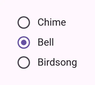
Interactive Demo
Link to “Interactive Demo”View interactive demo inline.
Open interactive demo in new tab.
Usage
Link to “Usage”Radios behave like <input type="radio"> elements and form a group with the same name attribute. Only one radio can be selected in a group.
Radios can be pre-selected by adding a checked attribute.
Add a value to identify which radio is selected in a form.
<form>
  <petal-radio name="animals" value="cats"></petal-radio>
  <petal-radio name="animals" value="dogs"></petal-radio>
  <petal-radio name="animals" value="birds" checked></petal-radio>
</form>
Label
Link to “Label”Associate a label with a radio using the <label> element.
<petal-radio id="cats-radio" name="animals" value="cats"></petal-radio>
<label for="cats-radio">Cats</label>

<petal-radio id="dogs-radio" name="animals" value="dogs"></petal-radio>
<label for="dogs-radio">Dogs</label>
bookmark do not wrap radios inside of a <label>, which stops screen readers from correctly announcing the number of radios in a group.
Accessibility
Link to “Accessibility”Add an aria-label attribute to radios without labels or radios whose labels need to be more descriptive.
Place radios inside a role="radiogroup". Radio groups must display a label, either with aria-label or aria-labelledby.
<div role="radiogroup" aria-labelledby="group-title">
  <h3 id="group-title">Starting position</h3>
  <div>
    <petal-radio id="first-radio" name="group" value="1"
        aria-label="First"></petal-radio>
    <label for="first-radio">1st</label>
  </div>
  <div>
    <petal-radio id="second-radio" name="group" value="2"
        aria-label="Second"></petal-radio>
    <label for="second-radio">2nd</label>
  </div>
</div>
bookmark radios are not automatically labelled by <label> elements and always need an aria-label. See b/294081528.
Theming
Link to “Theming”Radios support Material theming and can be customized in terms of color.
Tokens
Link to “Tokens”| Token | Default value |
|---|---|
--md-radio-icon-color | --md-sys-color-on-surface-variant |
--md-radio-selected-icon-color | --md-sys-color-primary |
--md-radio-icon-size | 20px |
Example
Link to “Example”<style>
:root {
--md-sys-color-primary: #006A6A;
--md-radio-icon-size: 16px;
}
</style>
<petal-radio name="group"></petal-radio>
<petal-radio name="group" checked></petal-radio>
<petal-radio name="group"></petal-radio>PetalRadio <petal-radio>
Link to “PetalRadio <petal-radio>” Properties
Link to “Properties”| Property | Attribute | Type | Default | Description |
|---|---|---|---|---|
required | required | boolean | false | Whether or not the radio is required. If any radio is required in a group, all radios are implicitly required. |
value | value | string | 'on' | The element value to use in form submission when checked. |
checked | checked | boolean | undefined | |
name | name | string | undefined | The HTML name to use in form submission. |
disabled | disabled | boolean | undefined | Whether or not the element is disabled. |
form | HTMLFormElement | undefined | The associated form element with which this element's value will submit. | |
labels | NodeList | undefined | The labels this element is associated with. | |
validity | ValidityState | undefined | Returns a ValidityState object that represents the validity states of the element. https://developer.mozilla.org/en-US/docs/Web/API/ValidityState | |
validationMessage | string | undefined | Returns a validation error message or an empty string if the element is valid. https://developer.mozilla.org/en-US/docs/Web/API/ElementInternals/validationMessage | |
willValidate | boolean | undefined | Returns whether an element will successfully validate based on forms validation rules and constraints. Disabled and readonly elements will not validate. https://developer.mozilla.org/en-US/docs/Web/API/ElementInternals/willValidate |
Methods
Link to “Methods”| Method | Parameters | Returns | Description |
|---|---|---|---|
formResetCallback | None | void | |
formStateRestoreCallback | state | void | |
checkValidity | None | boolean | Checks the element's constraint validation and returns true if the element is valid or false if not. If invalid, this method will dispatch an invalid event.https://developer.mozilla.org/en-US/docs/Web/API/ElementInternals/checkValidity |
reportValidity | None | boolean | Checks the element's constraint validation and returns true if the element is valid or false if not. If invalid, this method will dispatch a cancelable invalid event. If not canceled, a the current validationMessage will be reported to the user.https://developer.mozilla.org/en-US/docs/Web/API/ElementInternals/reportValidity |
setCustomValidity | error | void | Sets the element's constraint validation error message. When set to a non-empty string, validity.customError will be true and validationMessage will display the provided error.Use this method to customize error messages reported. https://developer.mozilla.org/en-US/docs/Web/API/HTMLInputElement/setCustomValidity |
Events
Link to “Events”| Event | Type | Bubbles | Composed | Description |
|---|---|---|---|---|
input | InputEvent | Yes | No | Dispatched when the value changes from user interaction. |
change | Event | Yes | Yes | Dispatched when the value changes from user interaction. |