Color
Color shows hierarchy and state, and carries a brand.
Color scheme
Link to “Color scheme”A color scheme assigns tones from the key color tones to roles, and the components use those roles.
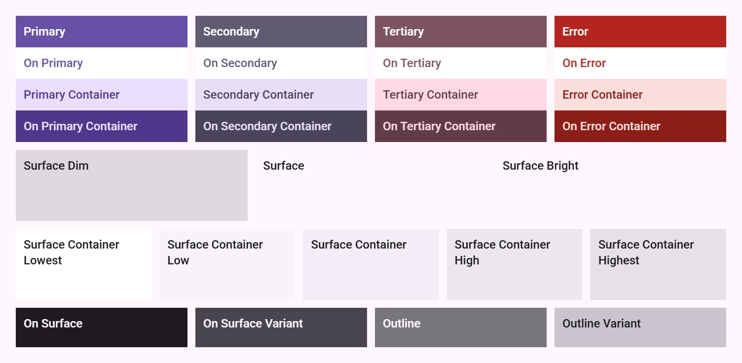
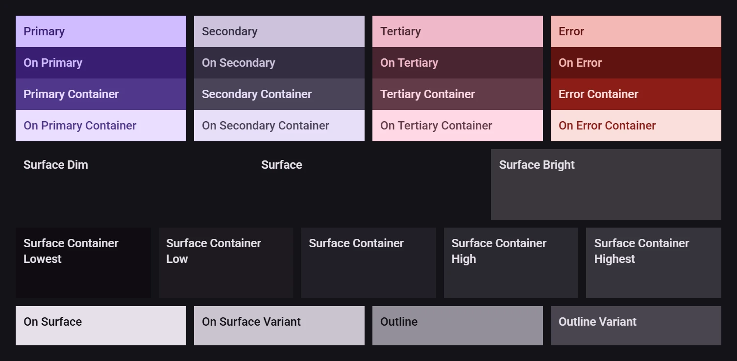
star use the Material theme builder Figma plugin to generate a color scheme.
Alternatively, use the
material-color-utilitieslibrary to generate color schemes at runtime.
Tokens
Link to “Tokens”A color scheme can be set using CSS custom properties. Tokens follow the naming convention --md-sys-color-<token>.
All tokens have a corresponding --md-sys-color-on-<token> for content color with accessible contrast.
| Key color | Tokens |
|---|---|
| Primary | --md-sys-color-primary |
--md-sys-color-primary-container | |
| Secondary | --md-sys-color-secondary |
--md-sys-color-secondary-container | |
| Tertiary | --md-sys-color-tertiary |
--md-sys-color-tertiary-container | |
| Error | --md-sys-color-error |
--md-sys-color-error-container | |
| Neutral | --md-sys-color-background |
--md-sys-color-surface | |
--md-sys-color-surface-bright * | |
--md-sys-color-surface-dim * | |
--md-sys-color-surface-container * | |
--md-sys-color-surface-container-lowest * | |
--md-sys-color-surface-container-low * | |
--md-sys-color-surface-container-high * | |
--md-sys-color-surface-container-highest * | |
--md-sys-color-outline | |
--md-sys-color-outline-variant |
* all surface tokens use --md-sys-color-on-surface or --md-sys-color-on-surface-variant for their content.
:root {
  /* Generated from Material Theme Builder Figma plugin
     or `material-color-utilities`. */
  --md-sys-color-primary: #006A6A;
  --md-sys-color-on-primary: #FFFFFF;
  --md-sys-color-primary-container: #6FF7F6;
  --md-sys-color-on-primary-container: #002020;
  /* ... */
}

/* Usage in custom components */
.primary {
  background: var(--md-sys-color-primary);
  color: var(--md-sys-color-on-primary);
}