Lists
Lists show items of text and images in a vertical column.
Interactive Demo
Link to “Interactive Demo”View interactive demo inline.
Open interactive demo in new tab.
Usage
Link to “Usage”<petal-list> is a container composed of <petal-list-item>s of different types.
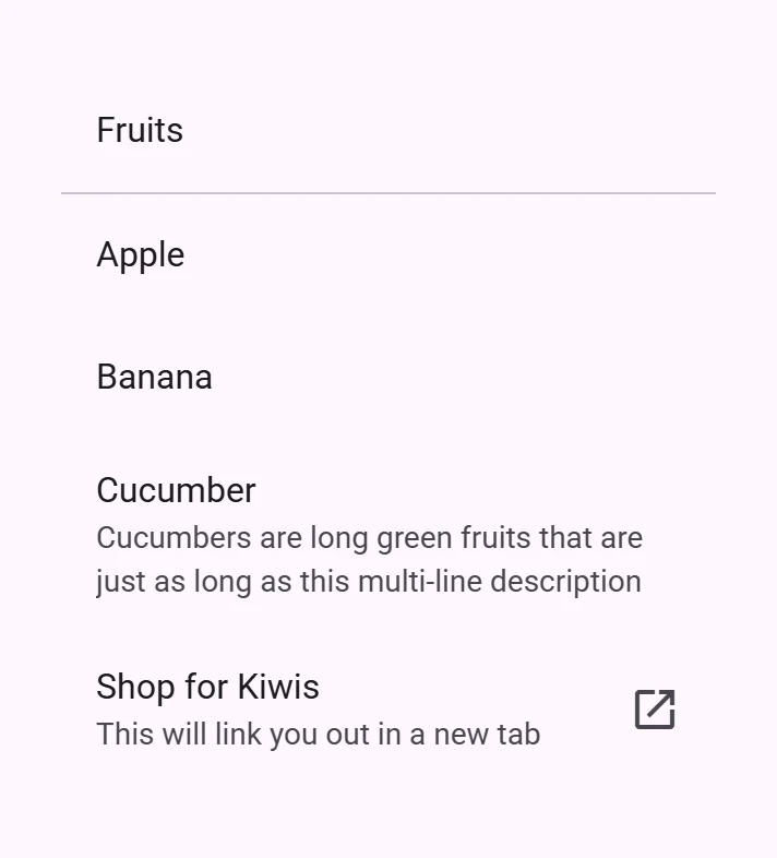
Cucumber
Cucumbers are long green fruits that are just as long as this multi-line description
Shop for Kiwis
This will link you out in a new tab
<petal-list style="max-width: 300px;">
  <petal-list-item>
    Fruits
  </petal-list-item>
  <petal-divider></petal-divider>
  <petal-list-item>
    Apple
</petal-list-item>
  <petal-list-item>
    Banana
  </petal-list-item>
  <petal-list-item>
    <div slot="headline">Cucumber</div>
    <div slot="supporting-text">Cucumbers are long green fruits that are just as long as this multi-line description</div>
  </petal-list-item>
  <petal-list-item
      type="link"
      href="https://google.com/search?q=buy+kiwis&tbm=shop"
      target="_blank">
    <div slot="headline">Shop for Kiwis</div>
    <div slot="supporting-text">This will link you out in a new tab</div>
    <petal-icon slot="end">open_in_new</petal-icon>
  </petal-list-item>
</petal-list>
Icon Items
Link to “Icon Items”Icons can be slotted into list-items' start or end slot.
<petal-list style="max-width: 300px">
  <petal-list-item>
    Rose
    <petal-icon slot="start">local_florist</petal-icon>
  </petal-list-item>
  <petal-divider></petal-divider>
  <petal-list-item>
    Tulip
    <petal-icon slot="start">filter_vintage</petal-icon>
  </petal-list-item>
  <petal-divider></petal-divider>
  <petal-list-item>
    Daisy
    <petal-icon slot="start">spa</petal-icon>
  </petal-list-item>
</petal-list>
Image Items
Link to “Image Items”Images should be slotted into list-items' start slot.


<petal-list style="max-width: 300px;">
  <petal-list-item>
    Rose
    <img slot="start" style="width: 56px" src="rose.jpg">
  </petal-list-item>
  <petal-divider></petal-divider>
  <petal-list-item>
    Tulip
    <img slot="start" style="width: 56px" src="tulip.jpg">
  </petal-list-item>
  <petal-divider></petal-divider>
  <petal-list-item>
    Daisy
    <img slot="start" style="width: 56px" src="daisy.jpg">
  </petal-list-item>
</petal-list>
Accessibility
Link to “Accessibility”List can have its role and tabindex set via the role and tabindex attributes, and list items can have their role and tabindex set via the type and tabindex attributes respectively.
bookmark List item has a limited set of types that can be set on it. This is to ensure that your list remains accessible with all other properties and options presented to it. See the ListItemType TypeScript type exported by list item for the current accepted values.
By default these values are set to role="list" and tabindex="-1" for list, and role="listitem" and tabindex="0" for list items.
Theming
Link to “Theming”List and List Item supports Material theming and can be customized in terms of color, typography, and shape.
List & List Item
Link to “List & List Item”| Token | Default value |
|---|---|
--md-list-container-color | --md-sys-color-surface |
--md-list-item-container-shape | --md-sys-shape-corner-none |
--md-list-item-label-text-color | --md-sys-color-on-surface |
--md-list-item-supporting-text-color | --md-sys-color-on-surface-variant |
--md-list-item-trailing-supporting-text-color | --md-sys-color-on-surface-variant |
--md-list-item-label-text-font | --md-sys-typescale-label-large-font |
--md-list-item-supporting-text-font | --md-sys-typescale-body-medium-font |
--md-list-item-trailing-supporting-text-font | --md-sys-typescale-label-small-font |
List & List Item Example
Link to “List & List Item Example”Apple
In stock
+100
Banana
In stock
56
Cucumber
Low stock
5
<style>
  :root {
    --md-list-container-color: #f4fbfa;
    --md-list-item-label-text-color: #161d1d;
    --md-list-item-supporting-text-color: #3f4948;
    --md-list-item-trailing-supporting-text-color: #3f4948;
    --md-list-item-label-text-font: system-ui;
    --md-list-item-supporting-text-font: system-ui;
    --md-list-item-trailing-supporting-text-font: system-ui;
  }
  [slot="trailing-supporting-text"] {
    width: 30px;
    text-align: end;
  }
</style>
<petal-list>
  <petal-list-item type="button">
    <div slot="headline">Apple</div>
    <div slot="supporting-text">In stock</div>
    <div slot="trailing-supporting-text">+100</div>
  </petal-list-item>
  <petal-list-item type="button">
    <div slot="headline">Banana</div>
    <div slot="supporting-text">In stock</div>
    <div slot="trailing-supporting-text">56</div>
  </petal-list-item>
  <petal-list-item type="button">
    <div slot="headline">Cucumber</div>
    <div slot="supporting-text">Low stock</div>
    <div slot="trailing-supporting-text">5</div>
  </petal-list-item>
</petal-list>
Icon List Item
Link to “Icon List Item”| Token | Default value |
|---|---|
--md-list-item-leading-icon-color | --md-sys-color-on-surface-variant |
--md-list-item-trailing-icon-color | --md-sys-color-on-surface-variant |
--md-list-item-leading-icon-size | 18px |
--md-list-item-trailing-icon-size | 24px |
Icon List Item Example
Link to “Icon List Item Example”Eggs
Ice Cream
Orange
<style>
  :root {
    background-color: #f4fbfa;
    --md-list-container-color: #f4fbfa;
    --md-list-item-label-text-color: #161d1d;
    --md-list-item-leading-icon-color: #006a6a;
    --md-list-item-trailing-icon-color: #006a6a;
    --md-list-item-leading-icon-size: 20px;
    --md-list-item-trailing-icon-size: 20px;
  }
  petal-list-item.unhealthy {
    --md-list-item-trailing-icon-color: #ba1a1a;
  }
</style>
<petal-list>
  <petal-list-item>
    <div slot="headline">Eggs</div>
    <petal-icon slot="start">egg</petal-icon>
    <petal-icon slot="end">recommend</petal-icon>
  </petal-list-item>
  <petal-list-item class="unhealthy">
    <div slot="headline">Ice Cream</div>
    <petal-icon slot="start">icecream</petal-icon>
    <petal-icon slot="end">dangerous</petal-icon>
  </petal-list-item>
  <petal-list-item>
    <div slot="headline">Orange</div>
    <petal-icon slot="start">nutrition</petal-icon>
    <petal-icon slot="end">recommend</petal-icon>
  </petal-list-item>
</petal-list>
Avatar List Item
Link to “Avatar List Item”| Token | Default value |
|---|---|
--md-list-item-leading-avatar-label-color | --md-sys-color-on-primary-container |
--md-list-item-leading-avatar-label-font | --md-sys-typescale-title-medium-font |
--md-list-item-leading-avatar-color | --md-sys-color-primary-container |
--md-list-item-leading-avatar-size | 40px |
--md-list-item-leading-avatar-shape | --md-sys-shape-corner-full |
Image List Item
Link to “Image List Item”| Token | Default value |
|---|---|
--md-list-item-leading-image-height | 56px |
--md-list-item-leading-image-width | 56px |
--md-list-item-leading-image-shape | --md-sys-shape-corner-none |
Image List Item Example
Link to “Image List Item Example”Rose

Tulip

Daisy

<style>
  :root {
    background-color: #f4fbfa;
    --md-list-container-color: #f4fbfa;
    --md-list-item-label-text-color: #161d1d;
    --md-list-item-leading-image-height: 50px;
    --md-list-item-leading-image-width: 100px;
    --md-list-item-leading-image-shape: 25px;
  }
  img {
    width: 40px;
  }
</style>
<petal-list>
  <petal-list-item headline="Rose">
    <img slot="start" src="rose-wide.jpg">
  </petal-list-item>
  <petal-list-item headline="Tulip">
    <img slot="start" src="tulip-wide.jpg">
  </petal-list-item>
  <petal-list-item headline="Daisy">
    <img slot="start" src="daisy-wide.jpg">
  </petal-list-item>
</petal-list>PetalList <petal-list>
Link to “PetalList <petal-list>” Properties
Link to “Properties”| Property | Attribute | Type | Default | Description |
|---|---|---|---|---|
items | ListItem[] | undefined |
Methods
Link to “Methods”| Method | Parameters | Returns | Description |
|---|---|---|---|
activateNextItem | None | ListItem | Activates the next item in the list. If at the end of the list, the first item will be activated. |
activatePreviousItem | None | ListItem | Activates the previous item in the list. If at the start of the list, the last item will be activated. |
PetalListItem <petal-list-item>
Link to “PetalListItem <petal-list-item>” Properties
Link to “Properties”| Property | Attribute | Type | Default | Description |
|---|---|---|---|---|
disabled | disabled | boolean | false | Disables the item and makes it non-selectable and non-interactive. |
type | type | ListItemType | 'text' | Sets the behavior of the list item, defaults to "text". Change to "link" or "button" for interactive items. |
href | href | string | '' | Sets the underlying HTMLAnchorElement's href resource attribute. |
target | target | "" | "_blank" | "_parent" | "_self" | "_top" | '' | Sets the underlying HTMLAnchorElement's target attribute when href is set. |
rel | rel | string | '' | Sets the underlying HTMLAnchorElement's rel attribute when href is set. |
referrerPolicy | referrerpolicy | string | '' | Sets the underlying HTMLAnchorElement's referrerpolicy attribute when href is set. |
Methods
Link to “Methods”| Method | Parameters | Returns | Description |
|---|---|---|---|
click | None | void |
Events
Link to “Events”| Event | Type | Bubbles | Composed | Description |
|---|---|---|---|---|
request-activation | Event | Yes | Yes | Requests the list to set tabindex=0 on the item and focus it. Used internally for list keyboard navigation; most applications do not need to listen for this event. It is exposed for authors building their own list-item replacements or wrapping items in a custom controller. |